Case Study: Reviving a Mid-Century Modern Deckhouse
Transforming a Dark and Dated Kitchen into the Heart of the Home
The kitchen is the heart of the home, and when that space becomes dark, dated, and cramped, it can affect not only the entire house but also the family. This mid-century modern deckhouse was in need of an update in order to make it more functional for the family as well as allow this home to shine in the way that it deserved.
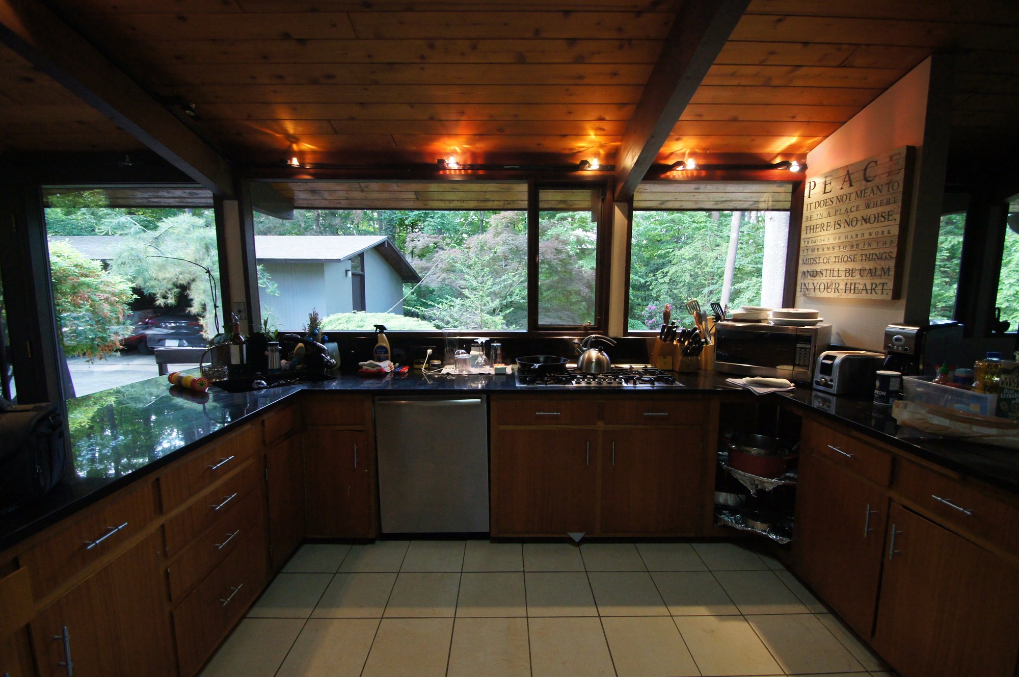
Although this space has a lot of windows because of its mid-century modern style, it still managed to look dark and cramped with its poor layout and cramped design.
The homeowners wanted to stay with the style of the home while connecting the rest of the main floor living to the kitchen and redesigning the space to better suit the everyday needs of this family.
PROJECT DETAILS
Category: Residential Kitchen
Year Home was Built: 1966
BEFORE THE TRANSFORMATION
PROJECT GOALS
The client's needs for this renovation included meeting and mixing both of their preferred design styles, modern and traditional, as well as improving the flow, function, and feel of the kitchen and dining room areas.
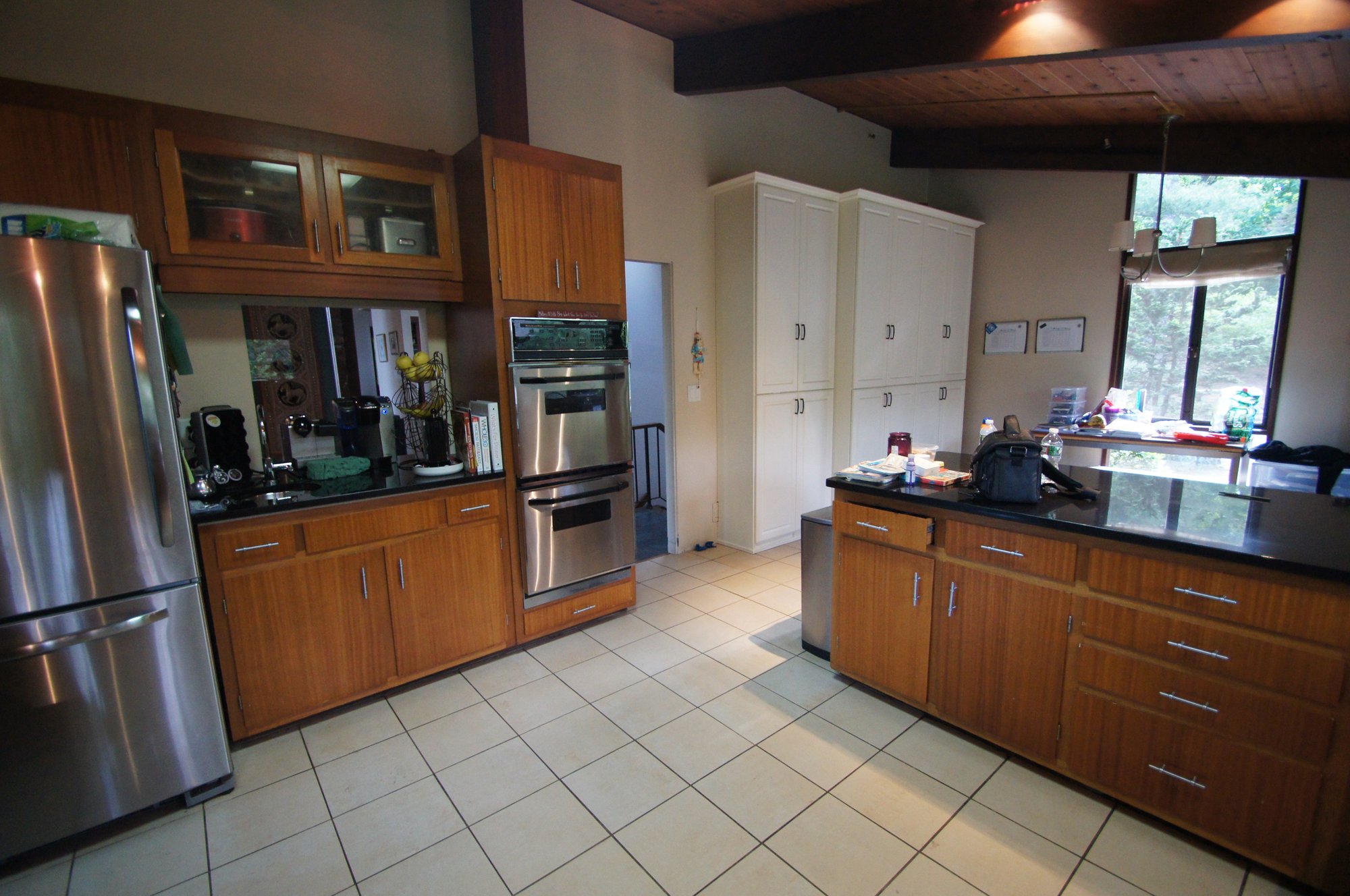
The old kitchen had very few options for storage, which made it difficult to keep the space as organized as they would like. The design and placement of the appliances in the kitchen also made it unnecessarily difficult to do everyday tasks such as cooking meals and gathering with family.
Enhancing the Flow, Function & Feel
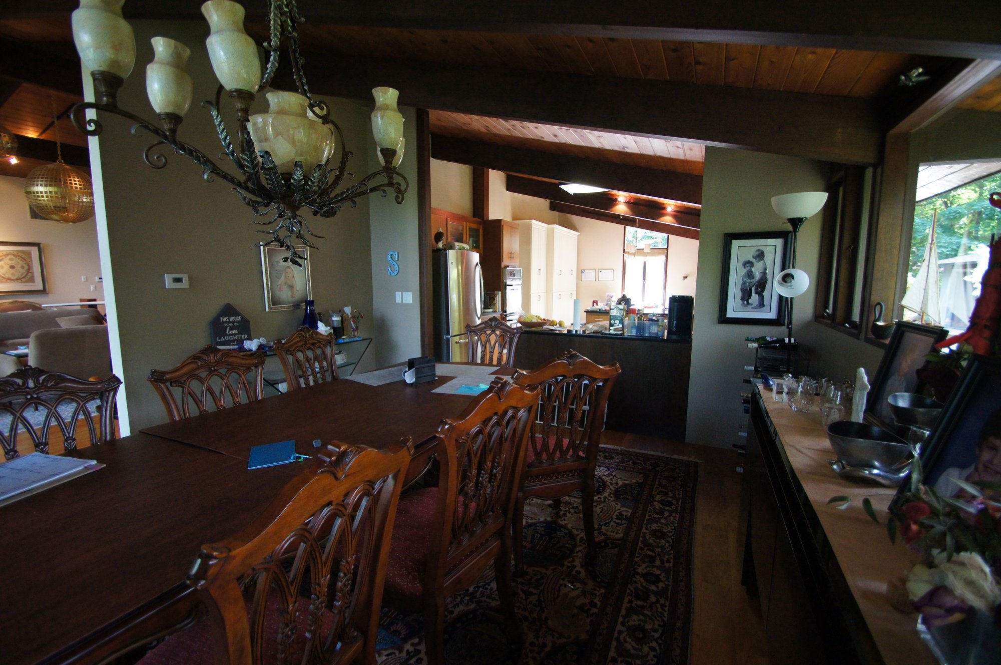
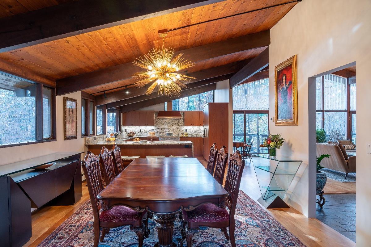
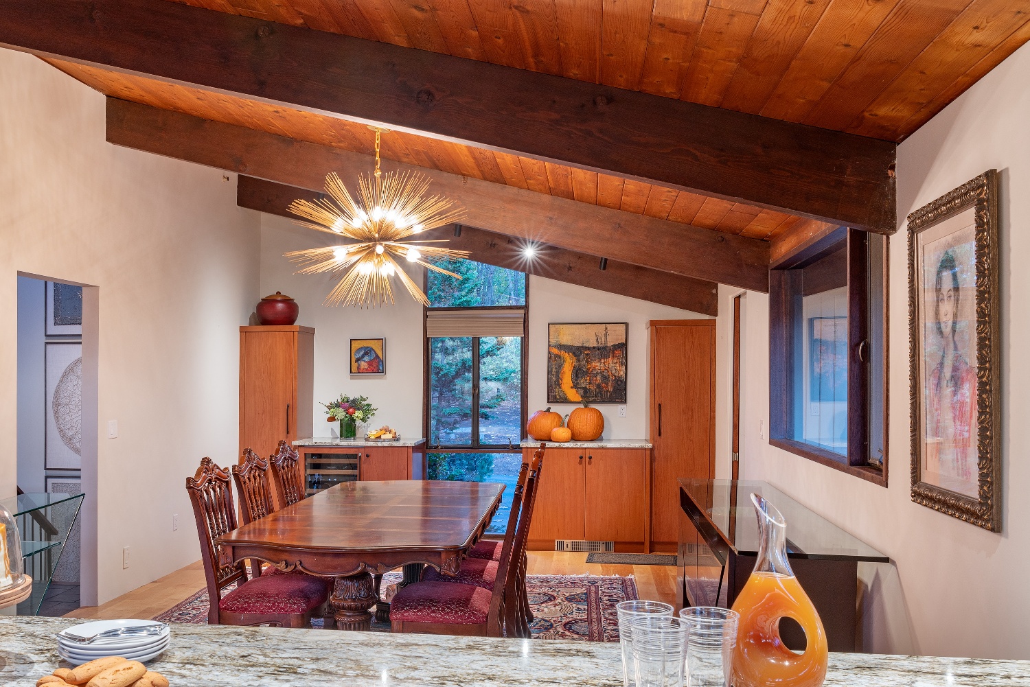
The existing dining room and existing kitchen swapped spaces to allow for a better flow and lighting was improved to really brighten the space and make it seem more open.
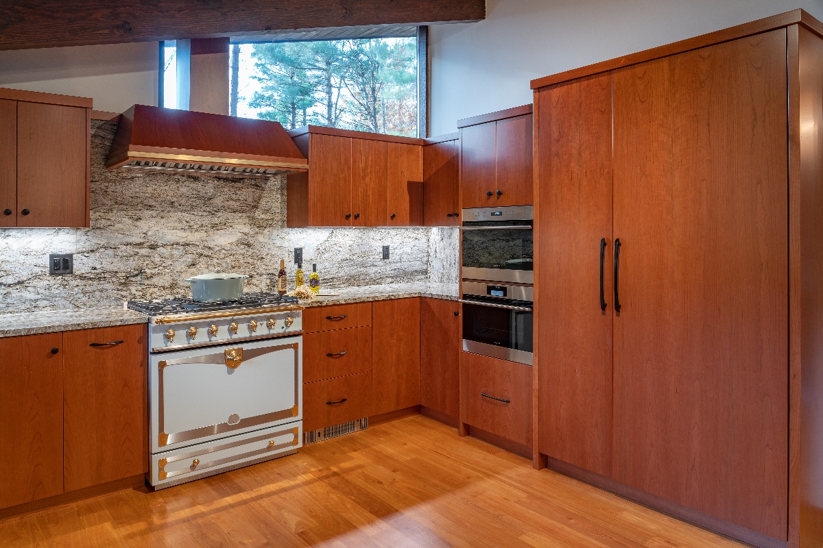
The kitchen was completely designed to have all new cabinetry, countertops, appliances, and plumbing to update the space, bringing it up to modern times while still keeping the mid-century modern style with some traditional elements as well.
Swapping Spaces and Updating Style
The new dining room is now connected to the mudroom, which then opens directly into the kitchen and family room.
Amplified Natural Lighting
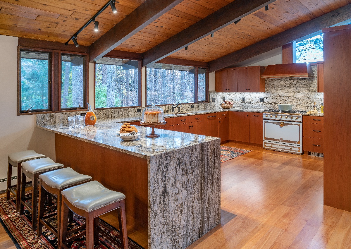
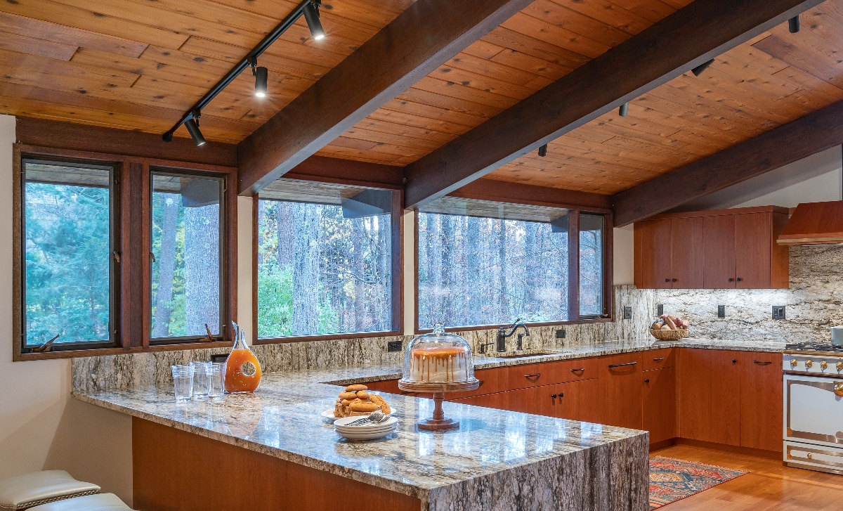
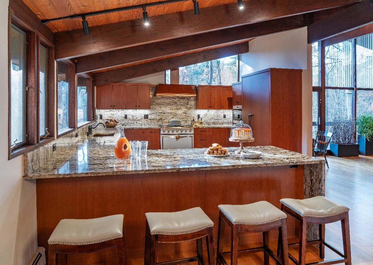
The rooms were transformed with a complete redesign of the lighting, aiming to brighten the space and infuse it with vitality. In addition to the captivating white and gray granite countertops with a stunning waterfall edge, this project boasts some unique elements.
The strategic decision to swap the location of the kitchen and dining room was made to maximize the influx of natural light and enhance the overall design.
From Cluttered to Functional and Inviting
The outdated kitchen had very few options for storage, which made it difficult to keep the space as organized as they would like. The design and placement of the appliances in the kitchen also made it unnecessarily difficult to do everyday tasks such as cooking meals and gathering with family.
By incorporating large, uninterrupted countertops and generous cabinet storage, this renovation has provided the client with a functional and inviting space for cooking and entertaining purposes.
Preserving Original Charm
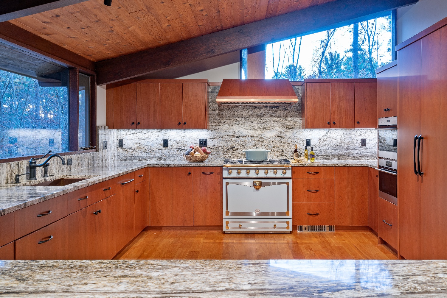
The kitchen underwent a complete redesign, incorporating new cabinetry, countertops, appliances, and plumbing to modernize the space while maintaining its mid-century modern style with a touch of tradition.
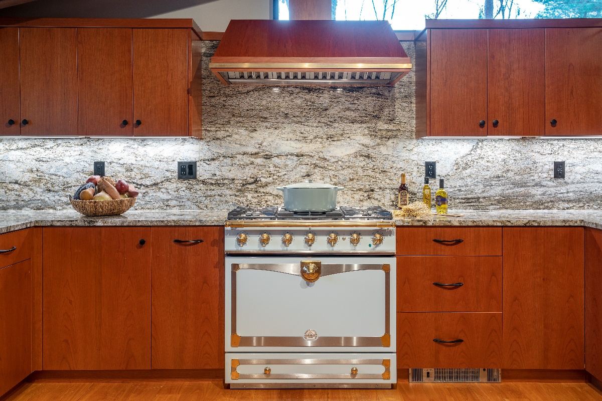
The addition of seamless granite backsplash, which extends along the countertop and waterfall edge, serves as a striking and distinctive focal point in the kitchen, enhancing its modern aesthetic.
Seamlessly Incorporating a New Ceiling Beam
Retaining the original open ceiling and beams on the first floor was a distinctive choice that allowed this mid-century modern deckhouse to maintain its original charm. A new beam was seamlessly incorporated during the removal of a wall, blending harmoniously with the existing exposed beams and enhancing the overall beauty of this unique home.
OVERCOMING OBSTACLES
- During the design phase of this project, our team encountered several obstacles that required us to think outside the box in order to overcome them. One significant challenge was the need to enhance the lighting in the space without using recessed lighting, as we wanted to maintain the original open ceiling with its beams intact. To address this, we maximized the natural light from the home's numerous windows and added track lighting along the beams in the kitchen and dining room areas.
- The final obstacle arose from the contrasting tastes of the two residents, with one favoring contemporary design and the other leaning toward traditional aesthetics. To satisfy both preferences, the revamped layout embraced the home's original mid-century modern architectural features and incorporated traditional elements like dining room furnishings and a distinctive, vintage-style stove. This seamless fusion of styles proved ideal for both homeowners, resulting in a stunning and truly unique living area.
THE FINAL RESULT
By the end of the project all of the clients needs, wants, and wishes were met within this project and they finally had a kitchen and dining room that they could be proud of.


.png?width=1200&length=1200&name=Untitled%20design%20(11).png)

Home renovation discovery CALL
Schedule your call with one of our renovation experts to share your goals and learn what sets Mitchell Construction Group apart from others.
